Growing Donations and Enrollment with Playful, Purposeful Design
Challenge: Turning interest into action to increase donations and enrollment

Project Summary
Increase donations and program enrollment by creating a user-friendly, emotionally supportive website that communicates the program’s impact and encourages women to join.
The existing site lacked clarity and emotional appeal, which affected both donor support and participant enrollment. To be successful, the site needed to clearly communicate its mission while providing accessible training information, emotional support, and relatable role models to encourage women who are new to running.
My Role + Teamwork
A key goal of the redesign was to increase user engagement and excitement while exploring the site, ultimately encouraging more participation in the program. As a nonprofit, it was also critical to make donation options clear and accessible throughout the experience.
• Make donation options visible on every page to support consistent fundraising opportunities and reduce user effort in finding ways to give.
• Simplify content into digestible sections to reduce overwhelm
• Brighten the color palette and visual design to create a more welcoming, motivational atmosphere
• Reorganize the navigation menu with a clear hierarchy, making it easier for users to find information, sign up, or donate
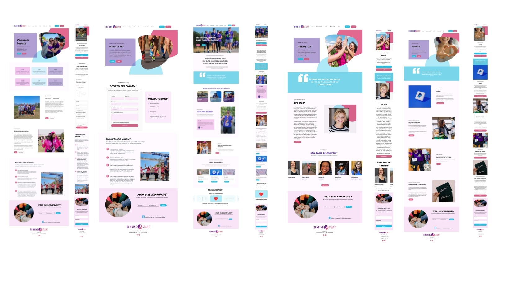
The Solution
Our design focused on three core solutions: increasing donations, improving enrollment, and enhancing clarity and transparency across the site. By streamlining content, elevating calls to action, and reinforcing trust through testimonials and clear program details, we created a user experience that supports both participants and donors while staying true to the nonprofit’s mission.


Solution 02
Enrollment & Clarity
• Highlighted program benefits and expectations to help users feel confident and informed before signing up.
• Design a clear, easy-to-complete sign-up form to streamline the enrollment process.
• Include testimonials as social proof to build trust and inspire first-time participants.
Action
Trust
Supports Growth


Solution 3
Transparency & Support
• Include program start dates, duration, and race day details to set clear expectations.
• Outline participant criteria so users could self-identify if the program is a good fit.
• Created a comprehensive FAQ section addressing common questions uncovered during user research.
Trust
Community
Desicion Making
01 Research
In the discovery phase, to understand the user and the organization's needs, interviews, surveys, and a SWOT analysis were performed to identify each one's needs and define motivations, barriers, questions new runners had, and the organization's most significant needs.

5 User Interviews & Stakeholder Input
User interviews revealed that the organization’s mission was unclear, the sign-up form was not accessible, and donation options were difficult to find.

Survey Insights
Survey responses showed that many potential participants felt intimidated by the idea of joining, reinforcing the need for encouraging messaging and social proof.

What can we learn from other websites?
SWOT analysis to better understand the organization’s positioning and uncover design opportunities and potential barriers. These insights informed our content priorities, trust-building features, and calls to action.
02 Define
Research revealed that users found the mission unclear, key actions like signing up and donating hard to access, and the overall experience unwelcoming. These insights guided us to simplify content, highlight calls to action, and design a more supportive, trust-building experience aligned with user and organizational goals.

Affinity Mapping
Connect your site to the most popular apps out there.

Heuristic Evaluation
Add effects with a few clicks and capture your audience’s attention when they land on your website.
Design & Layout
Design your site on a familiar free-form canvas. Visually set up your breakpoints to make it responsive.
03 Synthesis
In the ideation phase, we used mood boards, user flows, and wireframes to explore solutions based on our research. We prioritized clear navigation, visible donation options, and motivational content to support both user needs and organizational goals.

Prioritization Matrix
Defining the most important features

Bubble Gum Branding
Make the new site fun and exciting
04 Design
We translated our ideas into low- and mid-fidelity wireframes to test layout, content structure, and user flow. Based on feedback, we refined the design and developed high-fidelity mockups that aligned with the brand’s tone and goals.
The final designs reflect a clear, accessible, and emotionally engaging experience that supports both enrollment and donations.
05 Ideation
Based on usability testing feedback, we made key improvements to the interactive UI. These refinements helped reduce friction and made the experience more user-friendly and action-oriented.

• Encourage engagement
• Provide clear organization
• Better storytelling
• Enhances brand credibility & trust
• improves visual appeal
• Engages users with dynamic content

Closing Thoughts
Lessons Learning
This project reinforced the value of user-centered design in creating clarity, trust, and engagement. It was rewarding to design for a mission-driven organization and see how thoughtful UX can support both community impact and organizational goals.
Future Improvements
Future improvements could include integrating a donation tracker to boost transparency, adding a blog or resource section for new runners, and building a mobile-responsive onboarding flow to further streamline enrollment.
Tools
Figma
Canva
Miro
team
UI/UX Design
Joaquina Mascuch
Branding | UX/UI
Rachel Hixson
UX Research
Brittany Williams
UI/UX Design
Sam Glowinski
Content Design
Rachel Hixson