Increase Online Bookings by 25%
Challenge: Increase online bookings by 25% in 6 months.

Project Summary
I helped increase online bookings by 20% with a streamlined navigation, optimized CTA’s, and enhanced mobile responsiveness. By aligning the design with user behavior and brand goals, I improved usability, engagement, and overall conversion rates.
A redesigned Information Architecture, user-focused content, optimized CTA’s, and a new brand identity increased online bookings by 10% in the first month of the new website launch and 25% in six months. User engagement increased by 10% in the first month, bounce rate decreased by 25%, and phone calls to the business increased by 30% in the first month.
Research + Insights
User engagement with the website has dropped by 20%, resulting to a 15% decrease in bookings in 2023.
Hummingbird Wellness’s outdated website lacked clarity, accessibility, and consistent branding. The messaging was confusing, and the “Book Now” CTA was hard to find—breaking key UX principles and limiting user engagement.
The Solution

Solution 02
SImple is Better
• Create dedicated pages for each service to enhance focus and improve user navigation.
• Clear CTA's in nav bar and above fold.
• Replace long paragraphs with infographics, UI elements.
Reduce Desion Making
Encourage Action


Solution 3
Reduce Cognitive Load
• Craft user-center content to enhance clarity & support decision making.
• Ensure whitespace to avoid clutter & not to overwhelm with choices.
Trust
Community
Desicion Making
Research
Hummingbird Wellness primarily served women between the ages of 35–48. User data showed that most appointments were booked via mobile devices, and user research & competitive analysis revealed that users valued clarity, trustworthiness, and ease of booking.

Demographics

Competitive Analysis
Ideation
In the ideation phase, I translated user insights into actionable design ideas using Information Architecture, mood boards, and user flows. The focus was on creating a calm, intuitive experience by prioritizing trust-building content, clear navigation, and mobile-friendly booking features.

Information Architecture
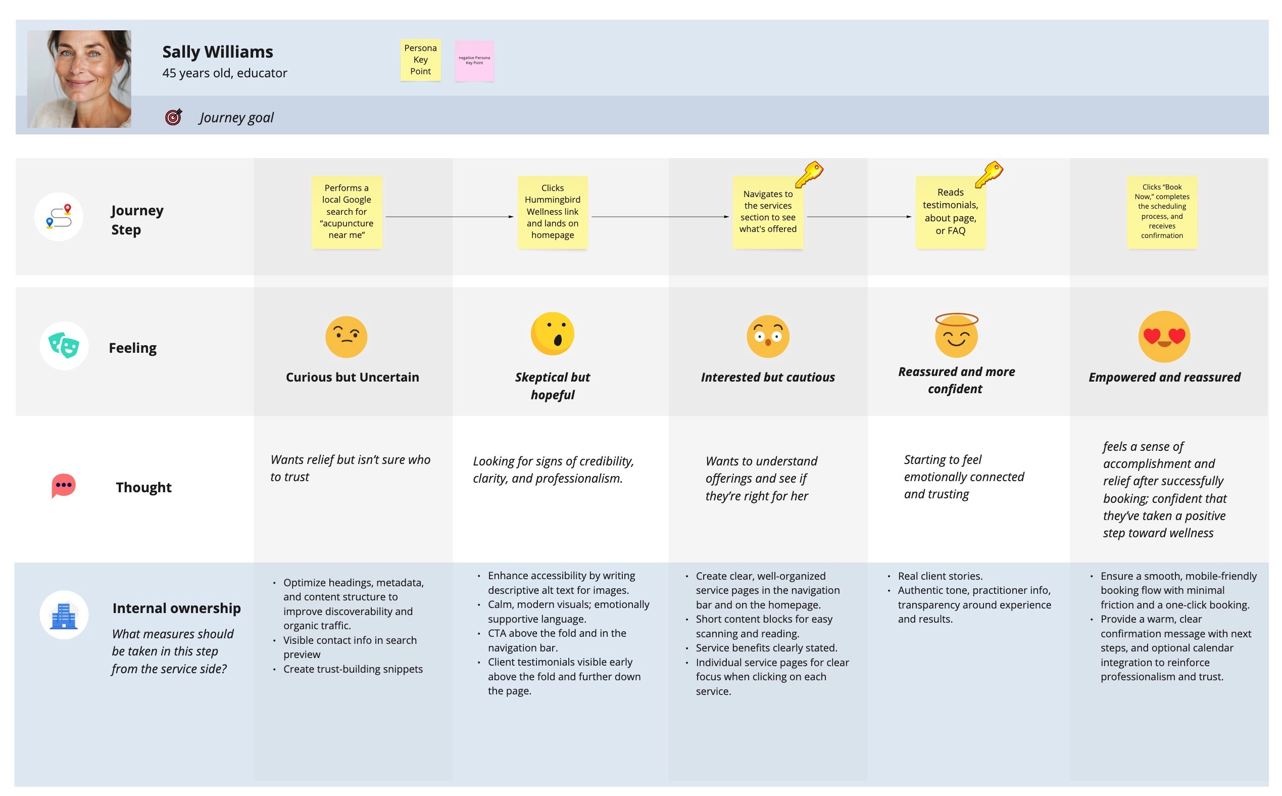
Customer Journey
Build Phase
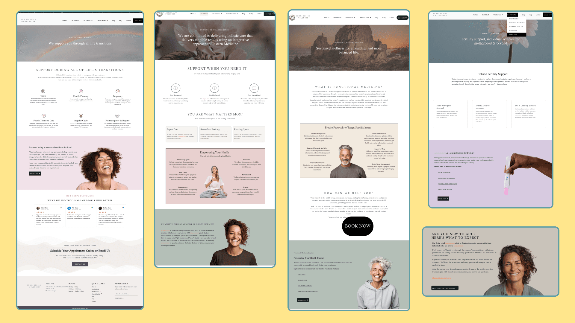
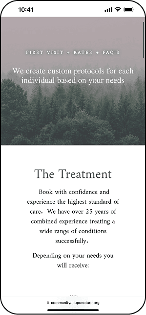
I translated ideas into WordPress high-fidelity designs focused on clarity, mobile usability, and trust. The layout, CTAs, and visuals were refined to reflect the brand’s calming tone and support a seamless booking experience.


Closing Thoughts
Lessons Learning
Through this project, I refined my design process by organizing workflows, tracking iterations, and using project management tools to stay focused and efficient. I also gained hands-on experience optimizing a WordPress theme for mobile, improving performance, applying SEO best practices, and conducting usability testing for a seamless user experience.
Future Improvements
Adding video content of services and treatment approaches will be helpful to continue improving conversions and bookings.
Tools
Elementor in WordPress
Google Analytics
CRM Integration
Figma
Canva
Miro
team
UI/UX Design
Joaquina Mascuch
Branding
Joaquina Mascuch
SEO
Joseph Han
Development
Joaquina Mascuch
Content Design
Joaquina Mascuch